Windows Forms controls smackdown (for MS Office)
Add-in Express provides us with some awesome tools for adding our own Office Task Panes and advance Outlook form and view regions, but making the UI elements on those panes and regions look good, is up to us.
Luckily for us there are a host of 3rd party UI control vendors providing a rich set of both Windows Forms and WPF controls. Which 3rd party vendor’s products work best for Microsoft Office developers? We’ll judge the controls on two areas:
- How fast do the components load in an Office Add-in?
- Which control suite looks the best in Microsoft Office?
The challenge
We’ll build an UI, for a Microsoft Excel Task pane, containing tabs, 2 grids, a combo box and a number of buttons and see just how fast each vendor’s components load in the add-in and how well it fits into Microsoft Office. We’ll give each component a score from 1 to 3. A score of 1 means the components does not fit into MS Office at all; 2 means the components looks much like the standard Windows Forms controls, but looks a little bit like MS Office and 3 means he components look great inside MS Office and/or it completely mimics the Office UI.
As any loyal fan of the TV show Mythbusters know, with any experiment you need a control or baseline sample. We’ll first build the UI using the standard Windows Forms controls to establish a control sample.
The contenders
In this article, we’ll test the Windows Forms components of the following vendors:
- ComponentOne
- DevExpress
- Infragistics
- Janus Systems
- SyncFusion
- Telerik and
- Xceed
Windows Forms a.k.a the control sample
Our control sample will be a standard Add-in Express COM Add-in written in Visual C# and targeting Microsoft Excel 2007 and above. Its layout will be a toolbar at the top and a tab control with three tabs, filling the rest of the control.
The first tab will have a grid control filled with order data from the Northwind sample database. The second tab will have another grid filled with a list of the Northwind customers and the last tab will have three buttons and a combo box.
The Windows Forms controls Task Pane, looked pretty much as suspected in Excel, it has a respectable average load time of 0.69 seconds. The load time includes the time it takes for the UI to initialize as well as load data from the database using standard .Net TableAdapters and DataSets,

Average Load Time: 0.69 seconds
Office Look and Feel Score: 1
SyncFusion
SyncFusion has a very nice control set. It has solid support for Office UI styles, as almost each control has an OfficeColorScheme property, which you can set to Blue, Silver or Black. This helps a lot in quickly theming your controls to fit in with the Office colour scheme and also allows you to programmatically change it depending on the Office theme the user has chosen.
Their grid has an interesting feature where you can set the colour of its scrollbars – which is a nice touch – to give your UI a unified look similar to Office.
The buttons and combo box also have the familiar Office coloured hover effect allowing your UI to fit in nicely with Office.


Average Load Time: 1.46 seconds
Office Look and Feel Score: 2
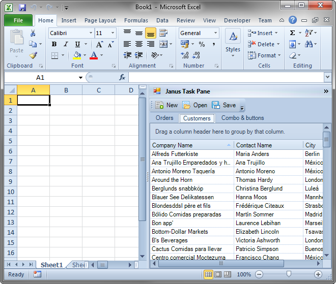
Janus
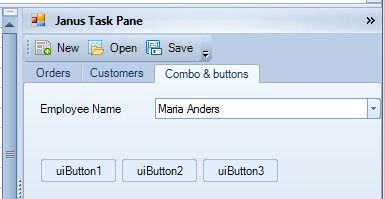
Janus Systems has been around for a while and their control set is not a bad one. They have VisualStyleManager and OfficeFormAdorner components that help you to quickly theme your UI controls to any one of the three Office colours.
Their grid control skins very nicely and their buttons have an interesting flat look and also have the Office styled highlight/hover effect.


Average Load Time: 1.53 seconds
Office Look and Feel Score: 3
Xceed
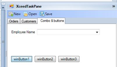
Xceed was the only vendor whose Windows Form controls did not support the different colour schemes of Office. The closest I came was setting the toolbar controls’ UIStyle property to Office2003. As far as I could see, none of the other controls had this property.
Their WPF control set does, however, appear to have support for the different Office UI styles.


Average Load Time: 0.91 seconds
Office Look and Feel Score: 1
ComponentOne
The ComponentOne toolset had a few interesting Office styled properties. Their tab control for one has a TabStyle property which could be set to Office2010, Office2007 and Office2003. Each of these settings gave a new look to the tabs. I chose Office2010 for this example.
The rest of the controls were very easy to apply an Office skin via their VisualStyle property. The VisualStyle property support all three (Blue, Black and Silver) colour themes of Office.
The ComponentOne TrueDBGrid is a very powerful grid component and also fully supports Office theming.


Average Load Time: 2.08 seconds
Office Look and Feel Score: 3
Telerik
Personally, I really enjoyed working with the Telerik control suite and in my opinion it is one of the best set of UI controls overall.
Telerik provides a number of theme components e.g. Office2010BlueTheme, Office2010BlackTheme and non-Office themes such as the TelerikMetroTheme. All you need to do is drop one of the theme components on your form and set the ThemeName property of your controls to the appropriate theme component and it is styled very nicely.
Their grid, tree view, combo box and button controls all has the Office hover effect and the shading on the tab and grid headers gave the UI a very nice and rounded look.
Overall one of my favourites!


Average Load Time: 2.97 seconds
Office Look and Feel Score: 3
Infragistics
The Infragistics controls have some support for Office theming but I found that only some of their controls have the option to select themes. Overall, their tab controls set themes nicely, although it only supports Office 2007’s blue theme and I could not find a quick way to change the theme colour.
Their grid is very impressive and powerful, but unfortunately lacks the ability to theme quickly.


Average Load Time: 2.63 seconds
Office Look and Feel Score: 2
DevExpress
DevExpress is up there with Telerik. Their controls were very easy to theme to the Office colours and are generally very easy to use as well.
Most of their controls can be themed via the LookAndFeel property, which provides a number of options including Office 2010 Blue, Office 2010 Black, Office 2010 Silver and VS2010.
Their buttons support the Office hover effect, but unfortunately their grid and combo box do not appear to.


Average Load Time: 1.79 seconds
Office Look and Feel Score: 3
The final results

| Vendor | Average Load Time with data(seconds) | Average Load Time without Data (seconds) | Look and Feel Score |
| Windows Forms | 0.73 | 0.69 | 1 |
| Xceed | 1.01 | 1.01 | 1 |
| SyncFusion | 1.49 | 1.46 | 2 |
| Janus | 1.89 | 1.53 | 3 |
| DevExpress | 2.07 | 1.79 | 3 |
| ComponentOne | 2.13 | 2.08 | 3 |
| Infragistics | 2.83 | 2.63 | 2 |
| Telerik | 3.30 | 2.97 | 3 |
Tests were performed in Office 2010 32-bit on a Windows 7 64-bit PC, with an Intel Core 2 Quad 2.50GHz processor and 4GB RAM.
And the winner is…
When it comes to speed, all the control suites fair very well and speed alone is certainly not a factor when deciding on a 3rd party vendor. However, Eugene pointed out to me that when you have a single add-in, speed might not be so important, when you have multiple add-ins speed becomes a very important consideration.
If I was using my own money and had to decide on a control suite I would have to go with Telerik. To me their controls look the nicest, and are incredibly easy to theme.
At the end of the day the winner is the vendor whose controls you like the most and find the quickest and easiest to work with.
Thank you for reading. Until next time, keep coding.
