.NET components for Office 2019, 2016, 2013, 2010 ribbons:
custom menu, tabs and controls in VB.NET, C#
|
Add-in Express™ Add-in Express Home > Add-in Express for Office and .NET > Online Guide > Add-in Express components > Office Ribbon components Starting from version 2007 Office provides the Ribbon user interface. Microsoft states that the interface makes it easier and quicker for users to achieve the wanted results. You extend the Ribbon interface by using the XML markup that the COM add-in returns to the host application through an appropriate interface when your add-in is loaded into the host version supporting the Office Ribbon UI.
Office Ribbon UI componentsThe Add-in Express Toolbox provides about 50 components for customizing the Microsoft Office 2019, 2016, 2013, 2010 and 2007 Ribbon that undertake the task of creating the markup. Also, there are five visual designers that allow creating the UI of your add-in: Ribbon Tab (ADXRibbonTab), Ribbon Office Menu (ADXRibbonOfficeMenu), Quick Access Toolbar (ADXRibbonQuickAccessToolbar), Ribbon BackstageView (ADXBackStageView), and Ribbon Context Menu (ADXRibbonContextMenu).
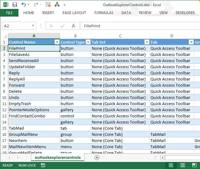
In Office 2010, Microsoft abandoned the Office Button (introduced in Office 2007) in favor of the File Tab (also known as Backstage View). When the add-in is being loaded in Office 2010, 2013, 2016 or 2019, ADXRibbonOfficeMenu maps your controls to the File tab unless you have an ADXBackStageView component in your add-in; in this case, all the controls you add to ADXRibbonOfficeMenu are ignored. Microsoft require developers to use the StartFromScratch parameter (see the StartFromScratch property of the add-in module) when customizing the Quick Access Toolbar. See also Developing Outlook COM add-in, Writing Microsoft Office COM add-in, and Ribbon tips. How Office Ribbon controls are createdWhen your add-in is being loaded by the host application supporting the Ribbon UI, the very first event received by the add-in is the OnRibbonBeforeCreate event of the add-in module (in a pre-Ribbon Office application, the very first event is OnAddinInitialize). This is the only event in which you can add/remove/modify the Ribbon components onto/from/on the add-in module. Then Add-in Express generates the XML markup reflecting the settings of the components and raises the OnRibbonBeforeLoad event. In that event, you can modify the generated markup, say, by adding XML tags generating extra Ribbon controls. Finally, the markup is passed to Office and the add-in module fires the OnRibbonLoaded event. In the event parameters, you get an object of the AddinExpress.MSO.IRibbonUI type that allows invalidating a control; you call the corresponding methods when you need the Ribbon to re-draw the control. Also, in Office 2010 - 2019 only, you can call a method activating a tab. Remember, the Ribbon designers perform the XML-schema validation automatically, so from time to time you may run into the situation when you cannot add a control to some level. It is a restriction of the Ribbon XML-schema. Still, we recommend turning on the Ribbon XML validation mechanism through the UI of the host application of your add-in; you need to look for a check box named "Show add-in user interface errors", see here. Referring to built-in Office ribbon controlsAll built-in Ribbon controls are identified by their IDs. While the ID of a command bar control is an integer, the ID of a built-in Ribbon control is a string. IDs of built-in Ribbon controls can be downloaded on the Microsoft web site: for Office 2007, for Office 2010 and for Office 2013. The downloads install Excel files; the Control Name column of each contains the IDs of almost all built-in Ribbon controls for the corresponding Ribbon (see the screenshot below). You may also find these files useful when dealing with changes in the Office 2013 Ribbon UI. Find more details about using them here. See also How to find the Id of a built-in Ribbon control.
Add-in Express Ribbon components provide the IdMso property; if you leave it empty the component will create a custom Ribbon control. To refer to a built-in Ribbon control, you set the IdMso property of the component to the ID of the built-in Ribbon control. For instance, you can add a custom Ribbon group to a built-in tab. To do this, you add a Ribbon tab component onto the add-in module and set its IdMso to the ID of the required built-in Ribbon tab. Then you add your custom group to the tab and populate it with controls. Note that the Ribbon does not allow adding a custom control to a built-in Ribbon group. Intercepting built-in Ribbon controlsYou use the Ribbon Command (ADXRibbonCommand) component to override the default action of a built-in Ribbon control. Note that the Ribbon allows intercepting only buttons, toggle buttons and check boxes; see the ActionTarget property of the component. You specify the ID of a built-in Ribbon control to be intercepted in the IdMso property of the component. To get such an ID, see Referring to built-in Ribbon controls.
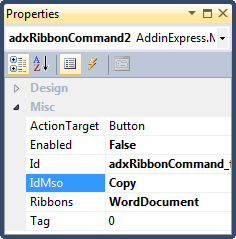
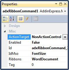
Disabling built-in Ribbon controlsThe Ribbon Command component allows disabling built-in Ribbon controls such as buttons, check boxes, menus, groups, etc. To achieve this you need to specify the IdMso of the corresponding Ribbon control (see Referring to Built-in Ribbon Controls), set an appropriate value to the ActionTarget property, and specify Enabled=false. Below are two examples showing how you use the Ribbon Command component to prevent the user from 1) copying the selected text and 2) changing the font size of the selected text.
Positioning Ribbon controlsEvery Ribbon component provides the InsertBeforeId, InsertBeforeIdMso and InsertAfterId, InsertAfterIdMso properties. You use the InsertBeforeId and InsertAfterId properties to position the control among other controls created by your add-in, just specify the Id of the corresponding components in any of these properties. The InsertBeforeIdMso and InsertAfterIdMso properties allow positioning the control among built-in Ribbon controls (see also Referring to built-in Ribbon controls). Images on Ribbon controlsMost Ribbon controls in Office require 32x32 or 16x16 icons. A Ribbon gallery allows using 16x16, 32x32, 48x48, or 64x64 icons. Supported formats are BMP, PNG and ICO, any color depth. You specify the icon using either the ImageList, Image, ImageTransparentColor, properties or the Glyph property that the corresponding Ribbon component provides. Note that Glyph allows bypassing a bug in the ImageList component: ImageList cuts the alpha channel out. In addition, Glyph accepts a multiple-page .ICO file containing several images. If provided with such a .ICO, the Ribbon component chooses an image from the .ICO at the add-in startup as shown in the following table:
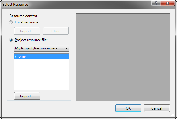
The image selection mechanism only works if you choose the Project resource file option (see the screenshot below) in the Select Resource dialog box opened when you invoke the property editor for the Glyph property. Choosing the Local resource option implies that the multi-page icon logic won’t be used.
Creating Ribbon controls at run timeYou cannot create Ribbon controls at run time because Ribbon is a static thing from birth; but see How Ribbon controls are created?) The only control providing any dynamism is Dynamic Menu if the ADXRibbonMenu.Dynamic property is set to True at design time, the component will generate the OnCreate event allowing creating menu items at run time (see sample code below). For other control types, you can only imitate that dynamism by setting the Visible property of a Ribbon control. For instance, you may need to display a custom control positioned before or after some other built-in control. To achieve this, you create two controls, specify the IdMso of the built-in control in the BeforeIdMso and AfterIdMso properties of the custom controls. At run time, you just change the visibility of the custom controls so that only one of them is visible. The sample code below demonstrates creating a custom control in the OnCreate event of an ADXRibbonMenu component. For the sample to work, the Dynamic property of the component must be set to True. Note that the OnCreate event occurs whenever you open a dynamic menu. Another example creates a dynamic submenu in a menu, which is dynamic as well. Here we also demonstrate using e.Contains() to check if a control exists on the menu. Updating ribbon controls at run timeAdd-in Express components implement two schemas of refreshing Ribbon controls. The simple schema allows you to change a property of the Ribbon component and the component will supply it to the Ribbon UI whenever it requests that property. This mechanism is an ideal when you need to display static or almost static things such as a button caption that doesn't change or changes across all windows showing the button, say in Outlook inspectors or Word documents. This works because Add-in Express supplies the same value for the property whenever the Ribbon UI invokes a corresponding callback function. However, if you need to have a full control over the UI, say, when you need to show different captions of a Ribbon button in different Inspector windows or Word documents, you can use the PropertyChanging event provided by all Ribbon components. That event occurs when the Ribbon expects that you can supply a new value for a property of the Ribbon control: Caption, Visible, Enabled, Tooltip, etc. The event allows you to learn the current context (see Determining a Ribbon control's context), the requested property and its current value. You can change that value as required by the business logic of your add-in. Determining a ribbon control's contextA Ribbon control is shown in a certain context. For the developer, the context is either null (Nothing in VB.NET) or a COM object that you might need to release after use (according to the rule given in Releasing COM objects). You retrieve and release the context object in these ways:
For a Ribbon control shown on a Ribbon tab, the context represents the window in which the Ribbon control is shown: Excel.Window, Word.Window, PowerPoint.DocumentWindow, Outlook.Inspector, Outlook.Explorer, etc. For a Ribbon control shown in a Ribbon context menu the context object may not be a window e.g. Outlook.Selection, Outlook.AttachmentSelection, etc. When debugging the add-in we recommend that you find the actual type name of the context object by using Microsoft.VisualBasic.Information.TypeName(). This requires that your project reference Microsoft.VisualBasic.dll. Sharing Ribbon controls across multiple add-insYou start with assigning the same string value to the AddinModule.Namespace property of every add-in that will share your controls. This makes Add-in Express add two xmlns attributes to the customUI tag in the resulting XML markup:
Originally, all Ribbon controls are located in the default namespace (id="%Ribbon control's id%" or idQ="default:%Ribbon control's id%") and you have full control over them via the callbacks provided by Add-in Express. When you specify the Namespace property, Add-in Express changes the markup to use idQ's instead of id's. Then, in all add-ins that are to share a control, for a container control with the same Id (you can change the Id's to match), you set the Shared property to true. For a control whose Shared property is true, Add-in Express changes its idQ to use the shared namespace (idQ="shared:%Ribbon control's id%") instead of the default one. Also, for such Ribbon controls, Add-in Express cuts out all callbacks and replaces them with "static" versions of the attributes. Say, getVisible="getVisible_CallBack" will be replaced with visible="%value%". The shareable Ribbon controls are the following container controls:
When referring to a shared Ribbon control in the BeforeId and AfterId properties of another Ribbon control, you use the shared controls' idQ: %namespace abbreviation% + ":" + %control id%. The abbreviations of these namespaces are "default" and "shared" string values. Say, when creating a shared tab, containing a private group, containing a button (private again), the resulting XML markup looks as follows: You can download an example here. |
